
Roughly each year, WordPress releases a new default theme that ships with a fresh WordPress installation. As of writing, this blog relies on Twenty Sixteen. Through its Customize option, it is possible to change most colours of the theme without having to dive into the editor at all. However, this left me with some elements that were to bright for my taste: text inputs, buttons and widget borders. So I had to use some custom styles to complete the transition. Read on for all the boring details! 🙂
Darker text input fields
I used Firefox’s inspector tool (F12, then click on button “Pick an element from the page”) to quickly navigate to the search field. In the tab “Rules”, I could identify which rule was applying the bright background colour. By copying the rule and changing only the colour-relevant values, this leaves the following two rules. I don’t use all the calendar-related inputs, but wanted to keep the selectors for consistency with the base style.
The second rule takes care of the hover state, i.e. once the input field is selected:
[code lang=”css”]
input[type="date"],
input[type="time"],
input[type="datetime-local"],
input[type="week"],
input[type="month"],
input[type="text"],
input[type="email"],
input[type="url"],
input[type="password"],
input[type="search"],
input[type="tel"],
input[type="number"],
textarea {
background: #2a2a2a;
background-image: none;
border: 1px solid #d1d1d1;
color: #f7f7f7;
}
input[type="date"]:focus,
input[type="time"]:focus,
input[type="datetime-local"]:focus,
input[type="week"]:focus,
input[type="month"]:focus,
input[type="text"]:focus,
input[type="email"]:focus,
input[type="url"]:focus,
input[type="password"]:focus,
input[type="search"]:focus,
input[type="tel"]:focus,
input[type="number"]:focus,
textarea:focus {
background-color: #333333;
border-color: #e1e1e1;
color: #fefefe;
outline: 0;
}
[/code]
Dark buttons
This was slightly trickier, as there were multiple “Rules” to identify. Also, I needed to employ the !important declaration to make these settings take priority over conflicting definitions.
[code lang=”css”]
button,
button[disabled]:hover,
button[disabled]:focus,
input[type="button"],
input[type="button"][disabled]:hover,
input[type="button"][disabled]:focus,
input[type="reset"],
input[type="reset"][disabled]:hover,
input[type="reset"][disabled]:focus,
input[type="submit"],
input[type="submit"][disabled]:hover,
input[type="submit"][disabled]:focus {
background: #4a4a4a !important;
color: #fefefe !important;
}
button:hover,
button:focus,
input[type="button"]:hover,
input[type="button"]:focus,
input[type="reset"]:hover,
input[type="reset"]:focus,
input[type="submit"]:hover,
input[type="submit"]:focus {
background: #3492ef !important;
}
[/code]
Widget borders
To further customise the look, I decided to make the widget borders green. The !important declaration again is needed to overwrite other definitions.
[code lang=”css”]
/* custom color for widget border */
.widget, .pagination {
border-top-color: #00aa44 !important;
}
[/code]
Excursion: custom social icon
While I’m at it, here is how I added a custom social icon for linking to Diaspora*:
[code lang=”css”]
/* custom symbol for diaspora social link */
.social-navigation a[href*="diasp.org/"]:before {
content: "\2731"; /* bold asterisk */
line-height: 28px; /* fix vertical position */
}
[/code]
Summary
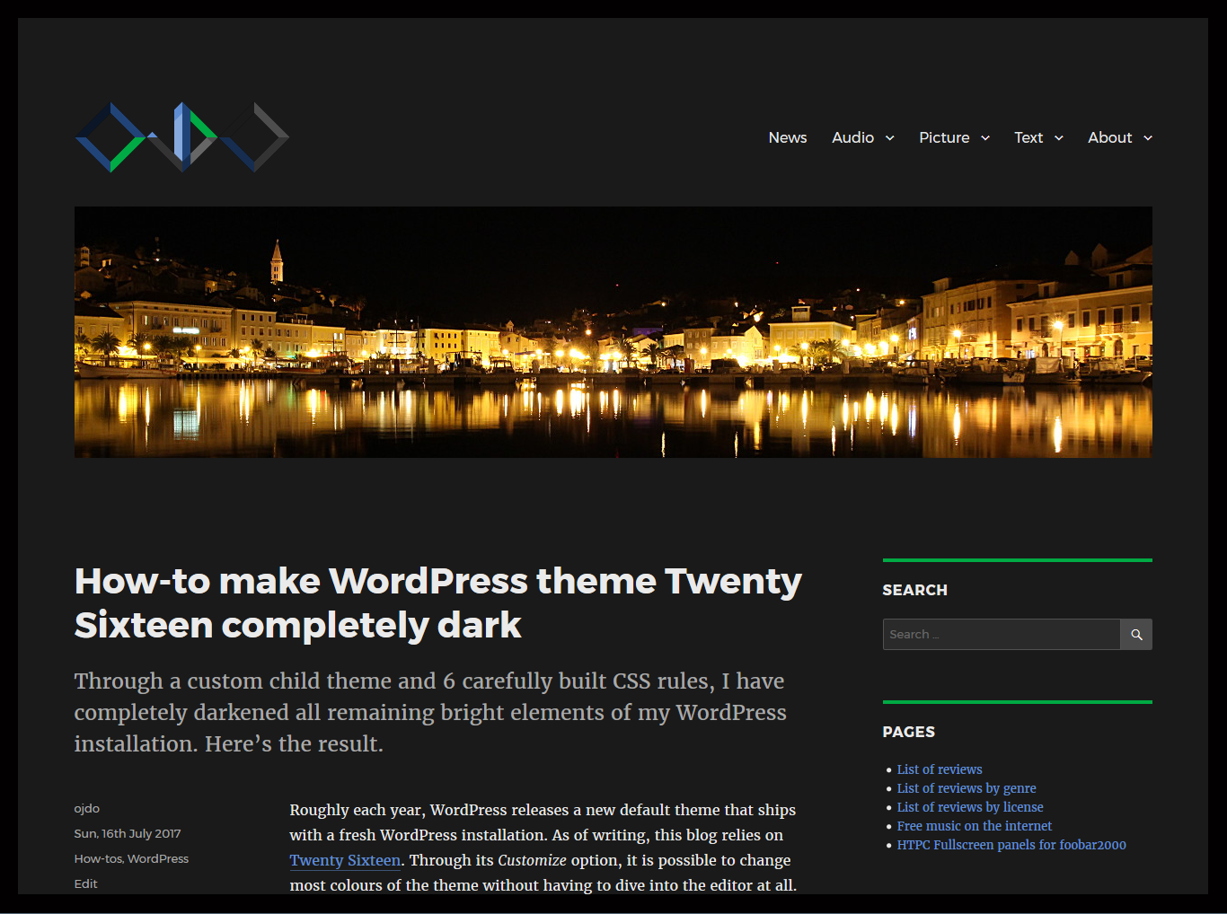
Just have a look at my complete child theme CSS file. Just in case I change my style again, here is a screenshot with these changes in action: